


A brand built for a smaller practice can become a ceiling for a growing one.
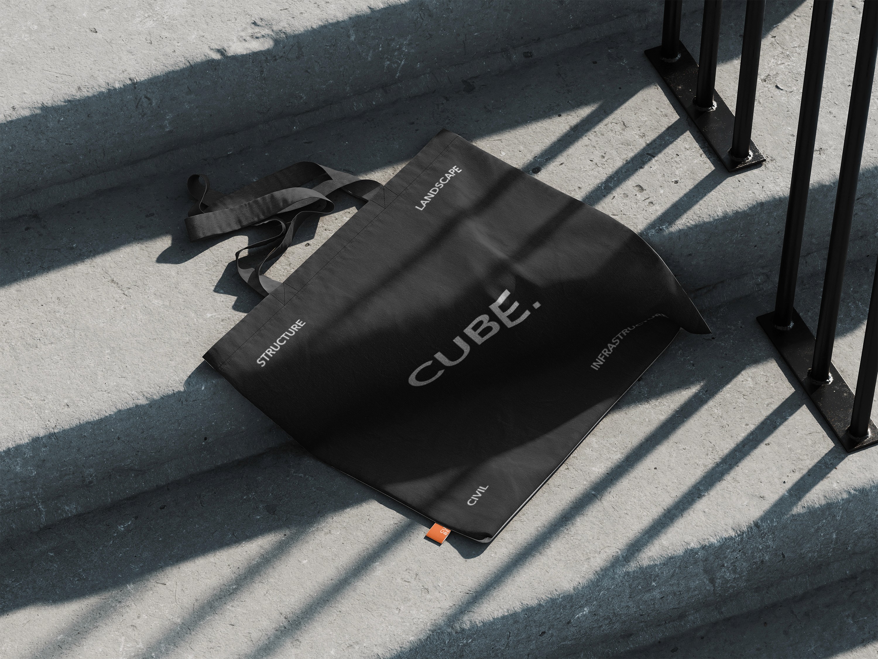
Cube had the credentials, the talent, and the ambition. What they lacked was a visual identity with the range to carry it all. Inconsistency across client-facing documents, proposals, and presentations was creating friction at exactly the moments that matter most. We refined the existing logo to preserve recognition while sharpening it into something more considered, then built a full brand system from the ground up. Proposal decks, sales presentations, and report templates were all designed using layout grids that reflect the same precision Cube brings to every project.


Cube now has a brand that reflects the practice they have built and the one they are building toward.
The logo refinement preserves the recognition Cube had earned while projecting a new level of maturity and precision. A full logo suite with variations for every application means the mark now lives consistently across every context. Proposal decks, sales presentations, and report templates built on layout grids carry that same rigour into every client interaction, so the quality of the presentation finally matches the quality of the work. Every document that leaves the business now says the same thing: this is a practice that takes precision seriously.
More Clients
Find Inspiration.


